Using Slides and Visuals Effectively
Written by TrainingCourseMaterial.com – trusted by thousands of trainers and facilitators worldwide for practical, editable corporate training content.
Slides can support your message. But if you misuse them—overloading with text, reading from them verbatim, or using distracting animations—they become a crutch. When used well, slides add clarity, create structure, and hold attention.
"The audience came for you, not your slides. The visuals support the story—you're the one who brings it to life." – Garr Reynolds, author of Presentation Zen
Tips for Impactful Visuals
- Limit the number of slides. One slide every 2–3 minutes is a good benchmark. Say it instead of showing it if possible.
- Use pictures and diagrams. Charts, flow visuals, and relevant photos simplify complex ideas.
- Stick to one key point per slide. Keep focus sharp. One idea, one slide.
- Check visibility. Walk around the room—can everyone see your content clearly?
Slide Design Best Practices
- Use consistent color themes. Stick to 3–4 colors with good contrast—light text on dark background or vice versa.
- Limit animation. Subtle transitions are fine. Avoid flying text or excessive effects.
- Create a roadmap slide. Show your audience the journey ahead. Use a summary slide at the end to reinforce key points.
- Keep bullets short. Max 5 bullets per slide. Max 5 words per bullet.
- Use descriptive keywords. Avoid full sentences. Long explanations belong in handouts.
- Number your slides. Helps participants follow along, especially if they join late.
Font and Text Tips
- Choose sans-serif fonts. Arial, Helvetica, or similar. Easier to read on screen.
- Use large font sizes. Aim for at least 20pt—bigger if presenting to a large group.
Breaking Slide Fatigue
- Include photos or video clips. They add energy and reset audience attention.
- Animate with purpose. Only use animation to explain flow or sequence. Keep it subtle.
- Have a backup. Carry printed slides or a USB copy in case of tech failure.
- Don’t hide behind your slides. You’re the messenger. The slides are there to support—not replace—you.
Example: One experienced trainer shared how they reduced a 40-slide deck down to 12 by focusing only on the key actions and concepts they wanted the audience to remember. Not only did engagement go up—but the session ran on time with better questions afterward.
📋 Free Presentation Skills Self-Assessment
Gauge your current strengths and areas for improvement. Our free tool helps you reflect on your presentation confidence and delivery style.
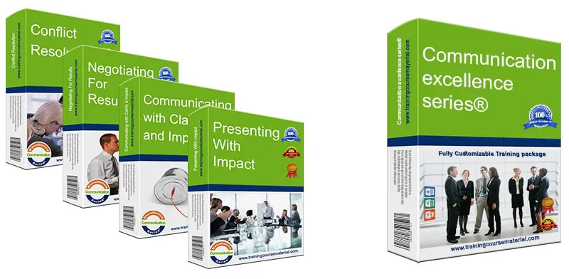
🎯 Presenting With Impact – Downloadable Training Package
Need to train your team or boost your own skills? This editable package includes slides, trainer guides, exercises, and practical tools to build engaging presentations.
👤 About the Author
TrainingCourseMaterial.com creates practical, customizable training content used by HR professionals, trainers, and managers around the globe. Our editors include certified trainers with 15+ years of experience delivering face-to-face and virtual sessions.
Reviewed and fact-checked by the TrainingCourseMaterial.com editorial team on . Originally published September 2021.